For years, a subtle unease has settled over Apple’s software. It’s a shift away from intuitive functionality and towards flashy aesthetics – a prioritization of *how things look* over *how they work*. Now, with Alan Dye, the former head of Human Interface Design, departing for Meta, a wave of anticipation is building among long-time Apple users.
Dye’s influence permeated the entire software ecosystem, and while he wasn’t solely responsible for the growing disconnect, the design direction ultimately flowed from his leadership. His departure offers a crucial opportunity: a chance to recapture the design brilliance that once defined Apple, a return to a philosophy that feels increasingly distant.
The feeling isn’t simply nostalgia. Apple’s designs were once so groundbreaking they were instantly imitated, a true mark of industry leadership. A great design should feel familiar, even on first encounter, and Apple historically excelled at this. The iPhone X’s swipe gestures, a feature Dye helped implement, were a prime example of this intuitive brilliance.
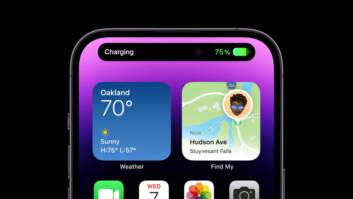
But lately, for every success, there seem to be just as many missteps. The Dynamic Island, while visually striking, doesn’t fundamentally improve the iPhone experience. It’s a refinement of the notch, not a revolution. It’s a beautiful solution to a problem that didn’t *need* a beautiful solution.
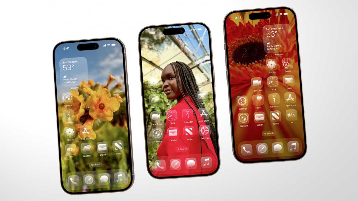
The new clear app icons in recent iOS versions are even more concerning. Icons are meant to be instantly recognizable, conveying their purpose at a glance. Transparency undermines this core function, prioritizing visual novelty over usability. It’s a change driven by aesthetics, not by a genuine need to improve the user experience.
Perhaps the most egregious example is the animated toggle switch. A toggle’s purpose is simple: on or off, immediate and ephemeral. Yet, the new animation transforms it into a distracting spectacle, slowing down the interaction and drawing unnecessary attention. It’s design for design’s sake, sacrificing functionality for fleeting visual appeal.

This embodies the core issue: a disconnect from the philosophy championed by Steve Jobs. Jobs didn’t see design as mere ornamentation. He famously said, “Design is how it works.” It’s about seamless functionality, intuitive interaction, and solving problems, not just creating something visually pleasing.
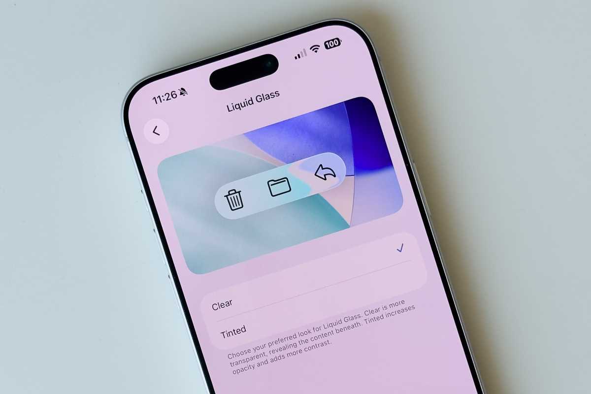
Dye’s presentation of Liquid Glass at a recent developer conference underscored this shift. He focused heavily on the *feeling* Liquid Glass was meant to evoke – joy, delight – while offering little explanation of its functional benefits. It felt like a visual overhaul driven by boredom, a desire for change without a clear purpose.
The reality of Liquid Glass has only reinforced these concerns. Overlapping text, illegible interfaces, and excessive animations create a confusing and frustrating experience. It’s a stark reminder of what happens when Apple forgets that design should serve the user, not the other way around.
These aren’t minor quibbles. The details matter. They define the user experience. And when those details are neglected, it impacts the overall quality of the product. It’s a subtle but significant erosion of the principles that once made Apple exceptional.
The appointment of Stephen Lemay as Dye’s successor offers a glimmer of hope. Lemay, an Apple veteran, is seen as someone deeply rooted in good software design principles, a stark contrast to Dye’s background in fashion and advertising.
Internal reactions to Lemay’s appointment have been overwhelmingly positive, with many designers expressing relief and even excitement. He’s known for his attention to detail and craftsmanship – qualities that have been sorely lacking in recent Apple designs.
A return to form won’t be immediate. Apple is a large organization, and Liquid Glass represents a significant investment. But with a leader who understands the fundamental principles of good design, there’s a real opportunity to steer Apple’s software back on track.
The hope is for a renewed focus on user experience, a dedication to refining the small details, and a commitment to the foundational ideas that once made Apple software the envy of the industry. A return to a philosophy where design isn’t just about how things look, but about how they *work*.