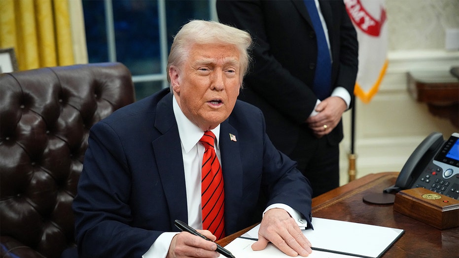
A stark division unfolded during a recent presidential address, revealing a deliberate strategy behind the presentation of economic data. As President Trump delivered a prime-time speech focused on the nation’s financial recovery, his communications team proactively shared a series of supporting slides with major television networks.
The intention was clear: to visually reinforce the President’s claims with documented data. However, a surprising pattern emerged. While one network, Fox News, opted to display the White House-provided graphics – albeit with a clear “White House graphic” label – the other major networks remained conspicuously silent, choosing not to incorporate the visual aids into their broadcasts.
The decision wasn’t based on disagreement with the data itself, but rather a lack of readily available sourcing information accompanying the charts. News executives, speaking anonymously, expressed concerns about presenting potentially unsupported figures to their audiences. This created a unique media landscape where viewers on different networks experienced dramatically different presentations of the same speech.

The discrepancy didn’t go unnoticed within the administration. Kevin Hassett, a former director of the National Economic Council, voiced his surprise, stating he “expected to see the slides everywhere” while channel surfing. He emphasized the significant effort invested in preparing the visual presentation, intended to clearly illustrate the President’s economic narrative.
The White House ultimately made the full presentation available through its official YouTube channel, allowing citizens direct access to the data. The President’s speech itself painted a picture of economic rescue, asserting he “inherited a mess” and was actively “fixing it,” contrasting his administration’s performance with perceived failures of the previous one.
He specifically highlighted rising costs under the prior administration – a 22 to 30 percent increase in car prices, a 30 to 50 percent surge in gasoline costs, and significant jumps in hotel and airfare rates. The core message centered on a reversal of these trends, with prices now “coming down, and coming down fast” under his leadership.
The President further pointed to specific examples, citing a 33 percent decrease in the price of a Thanksgiving turkey and an astonishing 82 percent drop in egg prices compared to the previous year. These figures were presented as evidence of tangible progress and a rapidly improving economic climate.
Adding to the economic narrative, a recent Consumer Price Index report revealed a lower-than-expected inflation rate of 2.7 percent in November, a decrease from 3 percent in September. While an October report was unavailable due to a government shutdown, the November figures offered further support for the administration’s claims of economic stabilization.
This strategic use of visual aids echoes a tactic employed by another renowned communicator, President Ronald Reagan. Known as “the Great Communicator,” Reagan frequently utilized flip charts during his prime-time addresses, particularly when discussing complex economic issues, leveraging his background in economics to connect with the public through data visualization.


